


Print has stopped pretending it is the future. That is partly why it matters again.
What makes print newly compelling is not nostalgia, but resistance: resistance to frictionless images, to endless scrolling, to visual work designed to disappear the moment it is consumed. The most interesting illustrators working now do not treat print as a secondary format for images made elsewhere. They treat it as a condition. A page has scale, weight, rhythm, sequence, and edges.
A printed image has to hold attention in a different way. It has to survive stillness.
That is where this new print language begins. Not in one style, but in a set of decisions: flatter color, sharper composition, more deliberate pacing, stronger silhouette, a renewed interest in the page as object rather than feed.
The six illustrators below are not identical, and that is the point.
Each represents a different print logic — comics, editorial compression, artist publications, risograph experimentation, screenprint craft, or cover-image atmosphere. Together, they suggest that some of the most alive illustrations in Europe are happening where print still slows the image down.
What Defines the New Print Language?
The phrase should not be mistaken for a movement. These artists do not belong to one school, nor do they share a single formal signature. What they share is a seriousness about how images behave once they enter print. Some work through comics and self-publishing. Others move through magazines, newspapers, posters, artist books, or print editions. But all of them understand that print changes the image. It gives it duration, sequence, and physical presence.
That matters because illustration now risks becoming too optimized for speed. The strongest print-based work pushes in the other direction. It makes room for ambiguity, letting the surfaces breathe and asking the reader to linger.
María Medem and the Principle of the Printed Dream
If one artist on this list feels made for the article’s premise, it is María Medem. Born in Seville in 1994, Medem began by self-publishing fanzines after studying Fine Arts, later publishing with small presses such as Terry Bleu and appearing in anthologies including NOW, Cold Cube, and Clubhouse. In 2025, Drawn & Quarterly published Land of Mirrors, her English-language debut, extending a practice that had already grown through comics, fanzines, and small-format publishing.
Medem’s print logic is serial and atmospheric. Her images rarely behave like standalone “illustrations” in the conventional editorial sense. They feel arranged in sequences, suspended between panels, memories, and fragments of environment. She works through recurrence rather than impact. Color becomes emotional weather. The page becomes a dream container. That is what makes her so important for print culture.
She reminds us that printed illustration can unfold slowly, without losing intensity.
Visualizza questo post su Instagram
Sergio Membrillas and the Shape of the Editorial Page
Where Medem works through drift and sequence, Sergio Membrillas works through concentration. Based in Valencia, Membrillas describes himself as a freelance illustrator and creative director, and recent profiles place him in editorial and cultural contexts that include The New Yorker, The Economist, The New York Times, Le Monde, Phaidon, and Monocle. He also teaches illustration, which is fitting for a practice so clearly built on disciplined visual thinking.
His print logic is editorial compression. Membrillas understands the page as a field of pressure: what has to be seen first, what can be implied, what can be reduced without losing force. His work often carries poster energy, but it is controlled by magazine and newspaper intelligence. It is built to land fast, then deepen on a second look. In an era when much illustration becomes either overly decorative or over-explained, Membrillas is a useful counterexample.
He shows how sharp editorial illustration can still shape the pace of reading.
Visualizza questo post su Instagram
Viktor Hachmang and the Logic of the Artist Publication
Viktor Hachmang is one of the clearest cases of illustration crossing into graphic art, comics, and the book-object. The Dutch illustrator and designer, based in The Hague, describes his practice as rooted primarily in comics and the graphic arts; his clients include The New York Times, Die Zeit, MIT Technology Review, and Wired, while his works are held in the collections of the Stedelijk Museum and the V&A. At the same time, his own publications and editions — including Twin Mirrors and other printed works sold through his shop — make it clear that the publication itself is central to the practice.
Hachmang’s print logic is the artist publication as world-building device. His images do not merely decorate pages; they create enclosed visual climates. The reference points range from ukiyo-e to European comics, but the result feels less like citation than recombination. This is work that understands printing as a way of staging atmosphere and sequence together.
Hachmang matters because he refuses the split between “editorial illustration” and “graphic art.” In print, the two become inseparable.
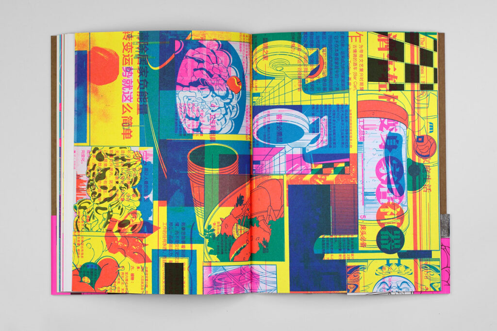
Antoine Orand and the Skills of the Riso Experiment
If Hachmang expands the artist publication into a visual world, Antoine Orand treats publication as an experimental lab. On his own profile, Orand describes himself as an artist focused mainly on drawing and as a publisher with Sub-Zero Press. Coverage of his work around the LA Art Book Fair and books such as Sabre, Claires Fontaines, and Alterego makes clear how closely his practice is tied to small-press culture, risograph printing, and the publication as an evolving graphic object. Sabre, for instance, was issued as a risograph-printed edition of 200 and described as a collection of drawings and print experiments.
Orand’s print logic is the publication as test site. The image is not finished before it enters print; it becomes legible through print. Risograph, color separation, diagrammatic flatness, and graphic abrasion are not stylistic garnish here. They are the method.
That matters because it places Orand inside a more serious conversation about contemporary publishing: one in which books and zines are not just vehicles for content, but the place where form is actively discovered.
Visualizza questo post su Instagram
Lucille Clerc and the Sense of the Printed Surface
Lucille Clerc brings a different kind of authority to this list: less about comics or small-press experimentation, more about material intelligence. Clerc is a French illustrator based in London who works mainly in editorial design and illustration for books and magazines. Her own site and related profiles emphasize that her process remains largely handcrafted from drawing to printing; she has practiced screenprinting through Print Club London and also works with etching and monotypes from France.
Her print logic is surface and layer. Clerc understands that a printed image can carry density in ways a screen often cannot. The hand-drawn line, the accumulated screenprinted layer, the slight tension between ornament and architecture — all of this gives the work a sense of material depth.
She shows that contemporary illustration does not have to choose between editorial clarity and printmaking craft. In her hands, illustration becomes a surface the viewer can almost feel.
Visualizza questo post su Instagram
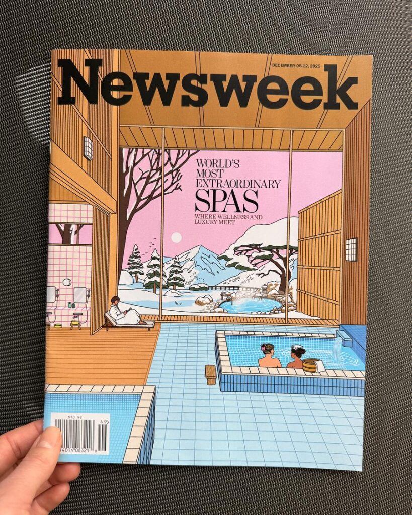
Maaike Canne and the Structure of the Printed Still Image
Maaike Canne is a Rotterdam-based illustrator and visual artist whose work draws on architecture, design, nature, and the compositional logic of Japanese woodblock prints. Her own description of the work emphasizes rhythm, pattern, flat areas of color, and a cinematic stillness. Recent and ongoing projects include editorial commissions for de Volkskrant and Elle Decoration alongside prints, paintings, and murals.
Canne’s print logic is the cover image and the frozen scene. Her images do not rush to narrate. They hold. Often they feel like interiors, facades, hotel lobbies, or architectural pauses waiting for a story to begin. That makes them unusually effective in print, where a single image may need to carry the mood of a feature, a section opener, or a cover.
Canne is important not because she is loud, but because she understands how restraint can make a printed image more memorable.

Why These Six Matter Now
What connects these illustrators is not simply talent, or geography, or even medium. It is a renewed seriousness about the printed image. Medem works through dream-sequence comics. Membrillas sharpens the editorial page. Hachmang expands the artist publication. Orand turns the risograph edition into a laboratory. Clerc restores the tactile depth of the printed surface. Canne gives stillness back to the single image.
That is why “the new print language” matters as a phrase. It names a shift away from illustration as pure content production and back toward illustration as form, pacing, and physical experience. These artists are not retreating from contemporary culture. They are redefining how images move through it — one page, one edition, one printed object at a time.

