


David Carson did not just break design rules. He changed the emotional range of typography and made editorial design feel louder, riskier, and more alive.
David Carson did not simply make magazines look messier. He changed what graphic design could do on the page. At a moment when modernist order still shaped much of editorial design, Carson pushed typography toward friction, texture, ambiguity, and mood. His layouts did not behave like neutral containers for content. They behaved as if they were part of the content itself. That shift became visible first in surf and youth culture publishing, then more famously in music media, where Carson made the page feel unstable, physical, and culturally charged rather than perfectly resolved. He came to design relatively late, after competitive surfing and teaching, which helps explain why his work never felt obedient to inherited rules.
How David Carson Changed Editorial Design
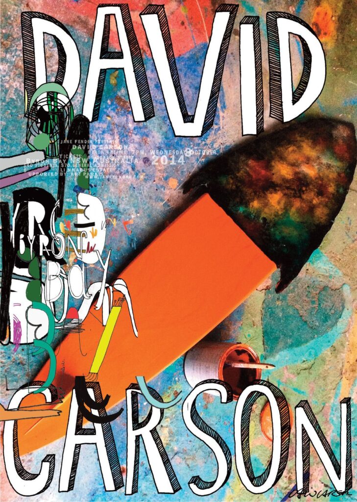
Carson’s importance begins with editorial design, not branding mythology. After moving into design work, he developed an approach that felt intuitive rather than doctrinaire. At Beach Culture, where he became art director in 1989, he produced only six issues before the magazine folded, yet that brief run earned more than 150 design awards and established him as a disruptive force. In 1992, he moved to Ray Gun, the alternative-music magazine that became the clearest expression of his visual language. During his time there, the magazine’s circulation tripled, which matters because it shows that his work was not only influential to designers. It is also connected with readers.
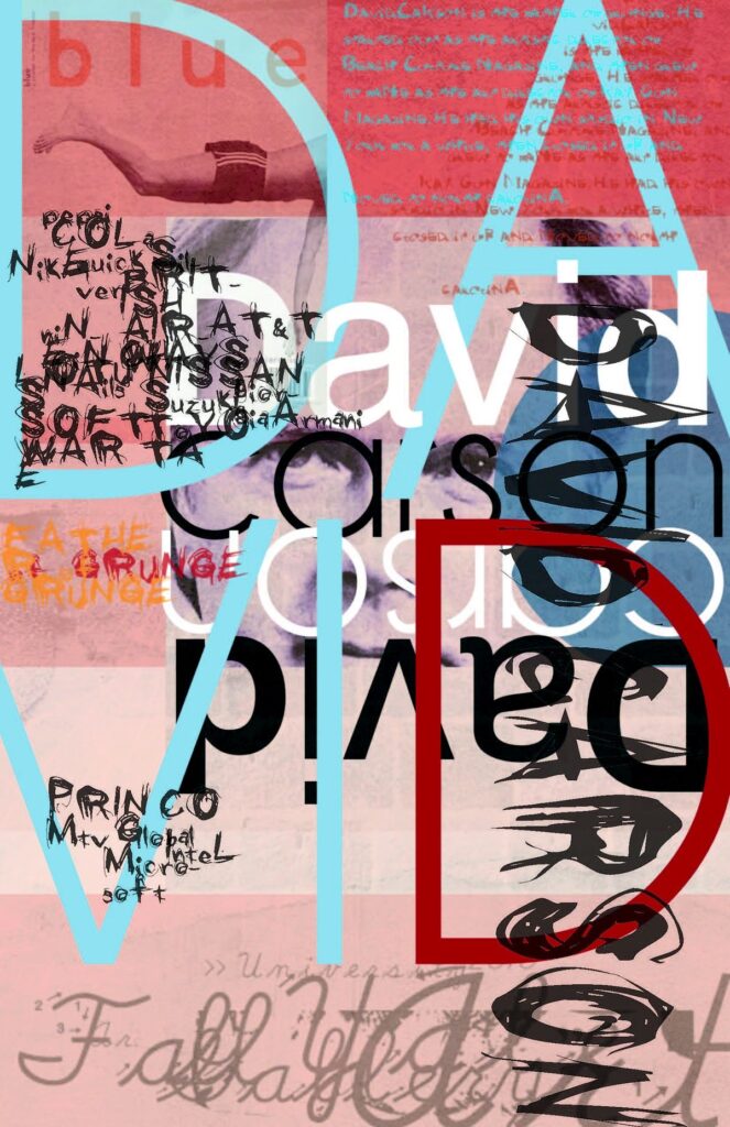
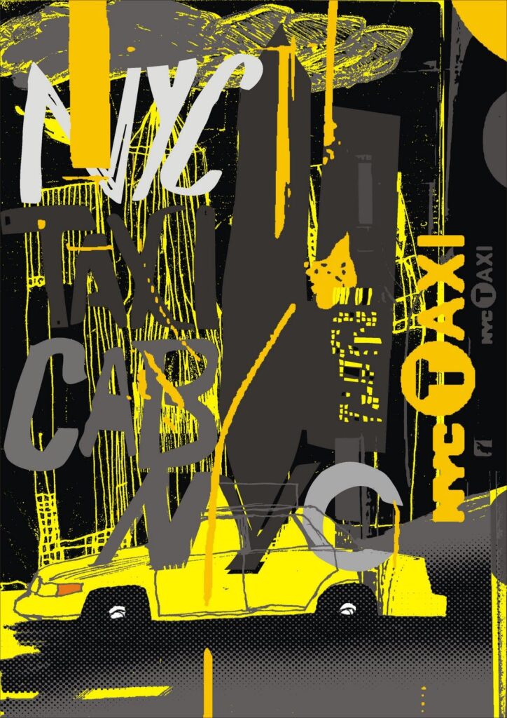
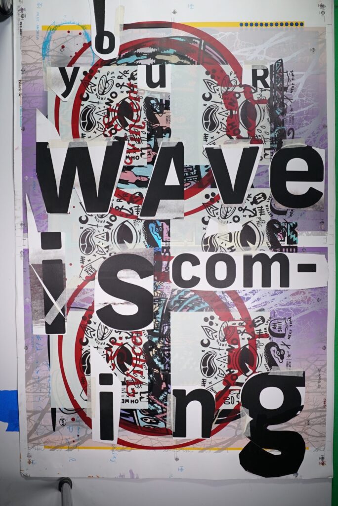
What made Carson different was not chaos for its own sake. It was his refusal to separate form from feeling. He treated typography as atmosphere, rhythm, and tension. Images overlapped. Hierarchies slipped. Type could fragment, stretch, collide, or disappear into texture. But the best Carson work never feels random. It feels responsive to subject matter, audience, and cultural tone. That is why his pages still matter: they argue that design is not just about transmitting information cleanly, but about shaping how information is felt.
AIGA later recognized Carson for breaking rules so radically that he pushed legibility to the edge of a different kind of communication.
David Carson and the Rise of Grunge Typography
Carson is often reduced to one label: grunge typography. The phrase is useful, but it can also flatten what he actually did. Yes, his work helped define the rougher, anti-grid visual language associated with the 1990s. His layouts embraced distressed textures, broken rhythm, compressed or layered text, and a deliberate sense of visual abrasion. But Carson’s real contribution was larger than a style trend.
He legitimized expressive typography inside mainstream editorial culture.
He made it harder to believe that readability and order were the only serious goals of graphic design.
The most famous example is the Ray Gun interview set in Zapf Dingbats, which turned text into a provocation. That gesture is often remembered as a stunt, but it also crystallized Carson’s central argument: typography is never neutral. Even when readers reject a page, they are still having a designed experience. That is why Carson remains such a divisive and productive figure in design history. He forces the question of where communication actually lives: in literal legibility or in the page’s total emotional effect.
Why David Carson Still Matters in Graphic Design
What survives from Carson is not permission to be messy. That is the lazy reading. The more useful lesson is that visual language should be specific to its cultural moment. Carson’s work belonged to the energy of alternative publishing, youth culture, and image-saturated media, but its broader principle still holds: design becomes memorable when it carries an attitude rather than a formula. That is why Carson’s influence still appears in magazine design, poster systems, experimental branding, and digital storytelling. Even designers who do not imitate his surfaces continue to work inside the permission structure he helped create.
His legacy also extends beyond the 1990s mythos. After leaving Ray Gun in 1995, Carson founded David Carson Design and continued working across publishing, advertising, and commercial commissions. The same year, he published The End of Print, the book that helped fix his reputation within design culture. In 2014, he received the AIGA Medal, one of the field’s highest honors, confirming that the establishment eventually absorbed the designer who once seemed its antagonist.
David Carson in the Context of Design History
David Carson endures because he reminded designers that clarity is not always the same as neatness. Sometimes the right page is restless, fractured, or difficult because the culture it reflects is the same. That is why he still matters now. Not as a nostalgia figure from the grunge era, but as a designer who permanently expanded the emotional and editorial possibilities of typography.
Read similar articles on hue&Eye Mag >
Go here to follow him on Instagram >
WATCH >>> David Carson Teaches Graphic Design | Official Trailer | MasterClass on Youtube!

