


Massimo Vignelli transformed design into a system based on order rather than decoration. His disciplined approach still defines how successful brands earn trust and recognition.
Before “brand systems” became a staple of startup decks and design teams, Massimo Vignelli was already proving that strong brands are not built from decoration. They are built in order. His work did not depend on novelty, noise, or visual tricks. It depended on structure: typography, grids, hierarchy, proportion, and repetition. That is one reason his influence still feels so present.
Even now, when brands span many platforms, the most effective ones still rely on Vignelli’s long-held principle: consistency is a form of clarity.
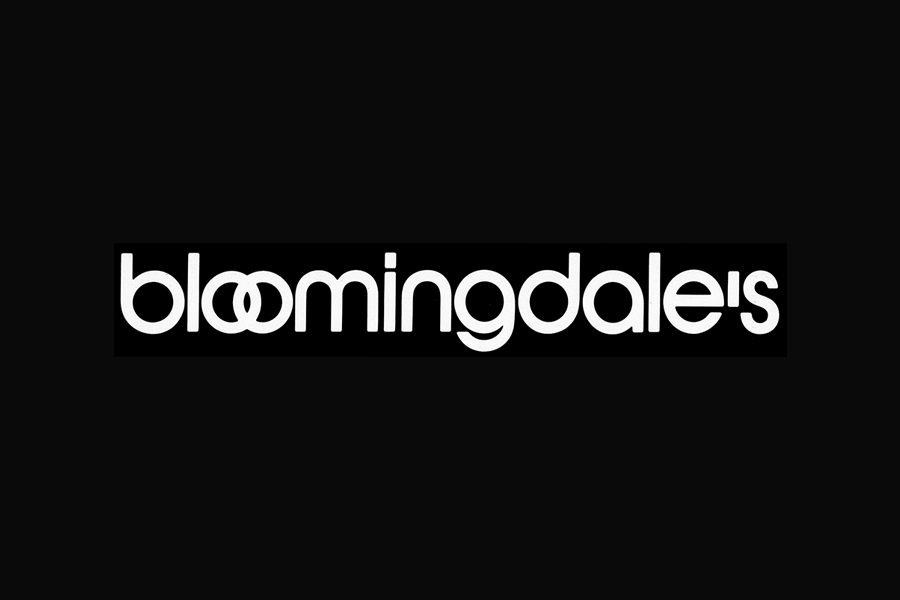
Vignelli remains one of the defining figures of modern graphic design because he understood identity as a system rather than a logo. The logo mattered, of course, but only as one part of a wider visual language. A brand had to speak in a recognizable voice at every touchpoint. In that sense, he was not just designing marks. He was designing behavior. And in today’s branding landscape, where every company wants to look coherent across fragmented media, that way of thinking feels less historical than urgent.
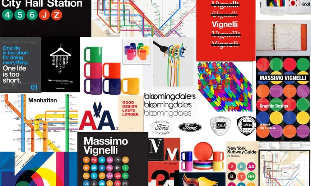
Massimo Vignelli Saw Design as a System, Not Decoration
One of the biggest misconceptions about Vignelli is that his work was simply minimalist. It was more rigorous than that. He believed design should reduce confusion, establish hierarchy, and create a sense of visual intelligence. His well-known preference for a limited set of typefaces was not dogma for its own sake. It reflected a broader conviction that design becomes stronger when it is disciplined.
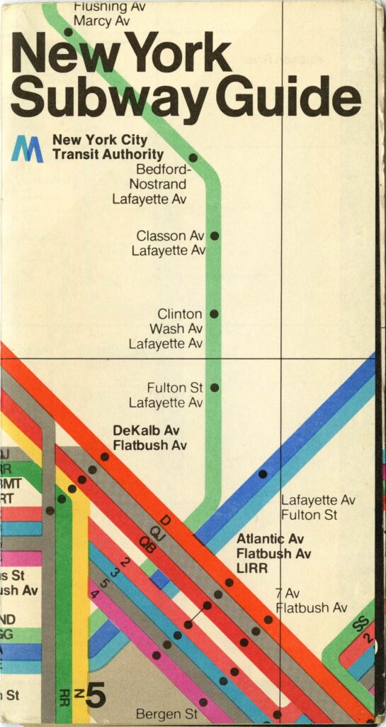
That discipline is what makes his work so enduring. Whether applied to corporate identity, editorial design, furniture, packaging, or transit graphics, the logic remains the same: create a structure that can hold complexity without looking chaotic. In practical terms, that meant grids, sharp alignment, controlled typography, strong negative space, and a refusal to clutter the page with unnecessary elements.
For modern brands, this remains a crucial lesson. Visual identity is powerful not from expressive campaigns, but from staying legible and coherent over time. Vignelli recognized this before digital “design systems” emerged.

Why Massimo Vignelli Still Shapes Modern Branding
The clearest reason Vignelli still matters is simple: the problems he solved are still our problems. Brands today are under pressure to appear everywhere at once. They need to function on mobile screens, in newsletters, on social feeds, in retail spaces, and within increasingly crowded visual environments. Under those conditions, consistency is not cosmetic. It is strategic—for audiences, this consistency makes brands easier to recognize, follow, and connect with across channels. This is where Vignelli’s legacy is especially relevant. His approach anticipated contemporary brand guidelines: strong brands define how elements behave together, set repeatable rules and rhythm, and ensure visual identity survives scale.
This idea—systematic, consistent design builds lasting brands—is Vignelli’s enduring legacy.
His work also reminds us that elegance in branding often comes from subtraction. The most memorable identities are not always the most complicated. They are the ones who know what to remove. In an era when many brands over-design in order to look distinctive, Vignelli’s method offers a corrective. Distinction does not come from adding more signals. It comes from making the right signals impossible to confuse.

Typography, Grids, and the Logic of Brand Trust
One of Vignelli’s greatest contributions was to treat typography as a strategic tool rather than a decorative layer. Type was not there to fill space or signal taste. It was there to create order, direct attention, and shape how a message was understood. In his world, typography carried authority.
That idea remains central to modern branding. When a brand feels trustworthy and clear, typography usually plays a key role. Rather than analyzing each type choice, audiences respond to consistency, recognition, hierarchy, and alignment.
The same applies to grids. Vignelli did not use them as invisible technical devices; he used them as the architecture behind visual meaning. Grids create rhythm. They make complexity navigable. They allow a brand to grow without losing it. This matters more than ever.never. Digital brands do not just need identity; they need systems that can stretch across formats, screens, teams, and campaigns. These systems not only strengthen the brand—they also give audiences smoother, more intuitive experiences with every interaction. That is why Vignelli’s thinking still feels contemporary. He designed with scalability in mind before the language of scalability became standard in branding.
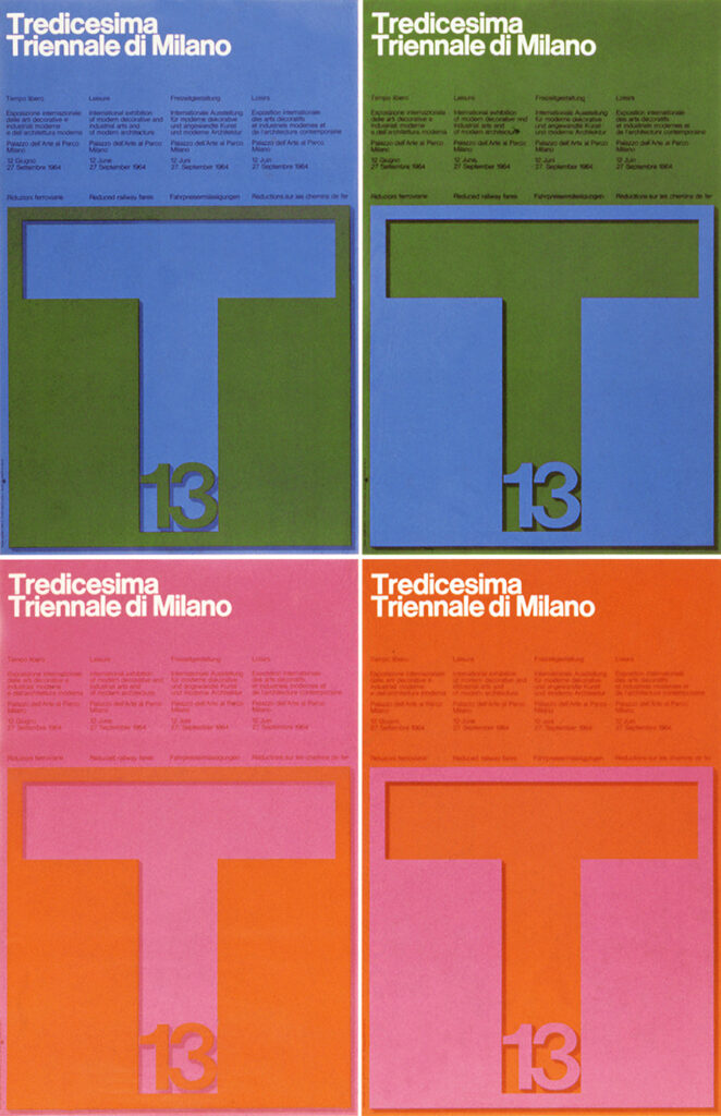
Poster, c.100×70 cm
1964
Reduction Matters in an Overstimulated Visual Culture
There is another reason Vignelli continues to shape how we see brands: he designed for attention before the attention economy became a crisis.
Today’s audiences move through overstimulated interfaces and image-saturated platforms. Every brand is competing not only with competitors, but with everything else on the screen. Under those conditions, clarity becomes a competitive advantage.
Vignelli’s work demonstrates that reduction can be emotionally powerful. A restrained visual system can communicate confidence, seriousness, and cultural authority—not just to the brand but also to audiences seeking clarity and reassurance in a crowded visual world. It can make a brand feel established rather than anxious. That matters especially to institutions, publishers, luxury brands, museums, and companies that want to project longevity rather than trend dependence. This is why his influence appears again and again in contemporary identity work. Not because designers are copying his style, but because they are still borrowing his priorities: clear typography, strong hierarchy, modular thinking, controlled repetition, and a belief that coherence builds trust.
Even when the visual language changes, the underlying logic remains recognizably Vignelli.
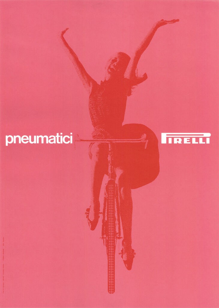
Poster, 68×48 cm
1963
The Limits of the Vignelli Design System
Vignelli’s legacy is not beyond criticism, and that is part of what keeps it alive. His system could be rigid. His confidence in universal design principles sometimes left less room for messiness, local context, or vernacular expression. Not every brand, audience, or cultural setting benefits from the same level of control. There are moments when strict order can flatten character rather than strengthen it.
This tension makes Vignelli’s work a model, not a mandate. The lesson: every brand requires a clear, disciplined system to support identity, rather than relying solely on style.
Designers do not need to imitate Vignelli’s surface. They need to understand his structure. The real inheritance is not a visual aesthetic. It is a way of thinking: build the rules first, then let expression happen within them.
What Designers and Brands Can Still Learn From Massimo Vignelli
The first lesson is that typography is never secondary. It is one of the main ways a brand thinks in public.
The second lesson is that systems scale better than moods. A brand built around a passing aesthetic may look timely for a season, but it rarely lasts. A brand built around a disciplined visual system can evolve without losing itself, so audiences never lose their sense of familiarity or trust. The third lesson is that clarity has cultural value. In a media environment full of excess, design that feels ordered and intentional still stands out. Not because it shouts the loudest, but because it knows exactly what it is, Vignelli still shapes brand design because he defined identity as a disciplined structure, not mere appearance.
As a Graphic Design Pioneer, he belongs near the center of the story: not as a relic of modernism, but as one of the clearest examples of how design becomes lasting when it becomes systematic.
