


April Greiman did not treat the computer as a shortcut. She treated it as a new landscape.
At a moment when many graphic designers still saw digital tools as cold, crude, or creatively suspicious, Greiman recognized something more unstable and more exciting: the screen could change not only how design was produced, but how it could think. Her work fused typography, photography, video imagery, color, architecture, and spatial experimentation into a visual language that felt radically open.
Born in New York in 1948, Greiman studied at the Kansas City Art Institute before continuing her education in Basel, Switzerland, where she encountered the discipline of Swiss modernism through figures including Armin Hofmann and Wolfgang Weingart.
From Swiss Discipline to California New Wave
Greiman’s importance begins with tension. She understood the grid, but she was not content to obey it.
In Basel, she absorbed the formal intelligence of European modernism: structure, clarity, hierarchy, proportion. But after moving to California, that training collided with a looser West Coast atmosphere shaped by experimentation, technology, pop culture, and new media. What emerged was not a rejection of design discipline, but an expansion of it.
Her early collaborations with photographer Jayme Odgers helped define what became known as California New Wave: layered, colorful, dynamic, and resistant to the flat authority of modernist communication. Greiman’s pages and posters did not simply arrange information. They seemed to move, breathe, interrupt themselves, and ask the viewer to participate.
When the Computer Became a Creative Medium
Greiman’s breakthrough came from seeing digital technology before it became visually respectable.
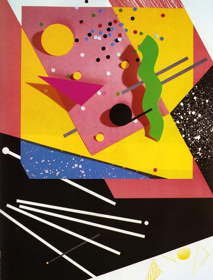
In 1986, she created Design Quarterly #133: Does It Make Sense? for the Walker Art Center, a now-iconic fold-out work that used the Apple Macintosh to combine image, typography, symbols, and digital space into a large-scale visual experiment. The work is held in major design collections, including MoMA and the Smithsonian’s Cooper Hewitt.
The piece mattered because it refused to hide the digital condition. Pixels, scans, awkward edges, hybrid imagery — these were not errors to be polished away. They became part of the meaning. Greiman made the computer visible as a medium, not invisible as a production tool.
That distinction still matters. Today, when digital aesthetics are often smoothed into templates, Greiman’s work reminds us that new tools are most powerful when they remain strange.

Why April Greiman Still Matters
Greiman’s legacy is not simply that she was “early” to digital design. Being early is not enough. What made her work iconic was her ability to give technology a body, a rhythm, and a sense of human vulnerability.
Her practice spanned graphic design, architecture, photography, public art, and spatial design through her studio, Made in Space, a Los Angeles-based consultancy that continues to describe its work through multidisciplinary environments and memorable spaces.
This is why Greiman belongs in the same conversation as Wolfgang Weingart, Neville Brody, and David Carson, but also apart from them. Weingart destabilized Swiss typography. Brody turned type into a subcultural attitude. Carson pushed legibility to the edge. Greiman did something more prophetic: she showed that digital design could be sensual, fragmented, intelligent, and alive.
The Iconic Lesson
April Greiman’s work still feels contemporary because it refuses the false choice between technology and intuition. Her designs are structured yet restless, technical yet emotional, futuristic yet unmistakably human.
In the age of AI, generative tools, augmented media, and automated visual systems, Greiman’s lesson is sharper than ever: the future of design is not defined by the newest tool, but by the designer willing to misuse it beautifully.

