


New Wave graphic design did not destroy the grid. It made the grid nervous.
Emerging in the 1970s and gaining force through the 1980s and 1990s, New Wave challenged the clean, rational certainty of Swiss modernism. It rejected the idea that typography should disappear into neutral communication. Instead, type became visible, emotional, fragmented, layered, and sometimes deliberately difficult. The page was no longer a transparent container for information. It became a field of active tension.
That shift began most powerfully with Wolfgang Weingart, but its consequences can be traced through designers as different as April Greiman, Dan Friedman, Neville Brody, and David Carson. Together, they changed graphic design from a discipline of order into a language of cultural disturbance.
Wolfgang Weingart and the Cracked Grid
Wolfgang Weingart is often called the father of New Wave typography, but that label can make his work sound more rebellious than it was. Weingart did not simply abandon Swiss design. He understood it deeply enough to bend it.
Trained within the discipline of Basel modernism, Weingart began questioning its strict rules: flush-left type, objective layouts, mathematical clarity, and the belief that good design should be almost invisible. He stretched letterforms, spaced type unpredictably, layered images, and turned typographic composition into something closer to rhythm than instruction.
His work was radical because it came from inside the system. Weingart showed that the grid was not a prison but a structure capable of exerting pressure, causing interruptions, and inflicting surprise.
From Swiss Order to Postmodern Energy
New Wave graphic design belongs to the broader postmodern turn in visual culture. By the late twentieth century, the promise of universal design language felt increasingly inadequate. Culture was becoming faster, more mediated, more ironic, and more fractured. Graphic design had to respond.
Designers began mixing photographic fragments, irregular spacing, diagonal compositions, distorted type, and layered visual codes. The result was not chaos for its own sake. At its best, New Wave made the viewer aware of how communication was constructed.
April Greiman pushed this further through early digital tools, using the computer not as a clean production device but as a new visual environment. Dan Friedman brought New Wave thinking into American design, education, and furniture, connecting typography with broader questions of lifestyle, politics, and form.
Neville Brody and the Typography of Subculture
If Weingart cracked the grid, Neville Brody electrified it.
Brody’s work for The Face in the 1980s turned magazine design into a visual expression of youth culture, music, fashion, and urban identity. His typography was not decorative styling added after the fact. It was the voice of the page.
Brody understood that magazines were cultural objects, not just editorial platforms. His layouts carried the energy of club culture, punk, constructivism, and digital experimentation. Letterforms became symbols of attitude. Headlines behaved like images. Design no longer served culture from the sidelines; it helped produce it.
For Hue & Eye readers, this connects directly to our existing coverage of Neville Brody’s graphic design legacy.
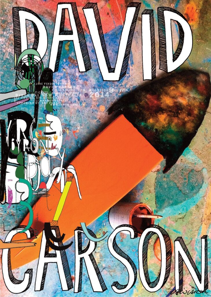
David Carson and the End of Easy Reading
David Carson pushed New Wave’s expressive logic into the 1990s with a more destructive, intuitive force. His work for Ray Gun magazine became famous for fractured layouts, distressed type, unconventional spacing, and pages that sometimes seemed to resist readability altogether.
Carson’s importance is often misunderstood. He was not simply making things “messy.” He was designing for a culture shaped by noise: alternative music, surfing, television, advertising, and the collapse of clean visual hierarchies. His pages felt unstable because the culture around them was unstable.
Where Swiss design asked for clarity, Carson asked whether clarity was always honest.
Why New Wave Still Matters
New Wave graphic design remains important because it exposed a truth that still defines visual culture today:
typography is never neutral. Every spacing decision, every distortion, every interruption carries a point of view.
In an age of templates, brand systems, and algorithmic sameness, New Wave feels newly relevant. It reminds designers that rules only matter when they can be tested. The best New Wave work was not anti-design. It was designed to become conscious of its own power.

