


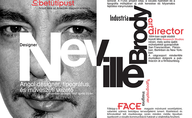
Who Is Neville Brody?
Neville Brody (b. 1957) is one of the most influential graphic designers of the late twentieth century, but his importance goes beyond style. He changed how typography could behave in public: not as a neutral carrier of information, but as a force that could shape mood, identity, and cultural meaning. From record sleeves and The Face magazine to digital type design and later brand systems, Brody helped move graphic design away from polite modernist order and toward a more charged, experimental visual language. That is why he still matters now — not simply as a design pioneer, but as a designer who changed the terms of visual communication itself.
Neville Brody’s Work and Practice
In the 1990s, Brody expanded his influence from magazine design into type design and broader visual communication. In 1990, he co-founded the FontFont library with Erik Spiekermann, establishing a major platform for contemporary digital type. A year later, he launched FUSE with Jon Wozencroft, treating typography as an arena for cultural and technological debate. In later decades, his practice moved further into brand systems and digital communication for clients including BBC Online, Channel 4, and The Times. This shift shows Brody was never only a magazine designer: he was part of the wider transition from print-era experimentation to the visual systems that shape media and brands today.
(P) 2009 Bauer London Lifestyle Ltd
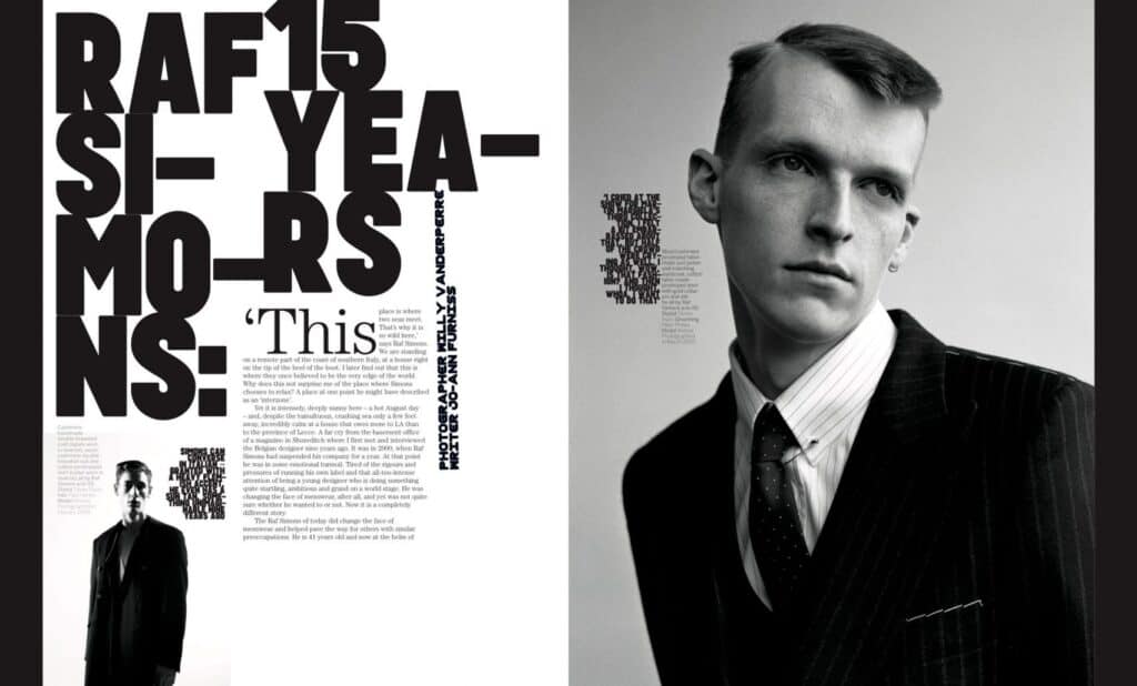
Photo: Willy Vanderperre
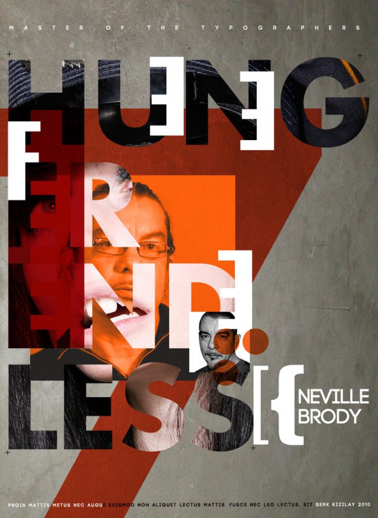
Spread from The Graphic Language of Neville Brody 3 © 2023 Neville Brody
Neville Brody’s Influence on Contemporary Design
Brody’s influence extends beyond his own body of work into the way contemporary design operates. He helped make typography feel active, unstable, and culturally charged rather than neutral or purely functional.
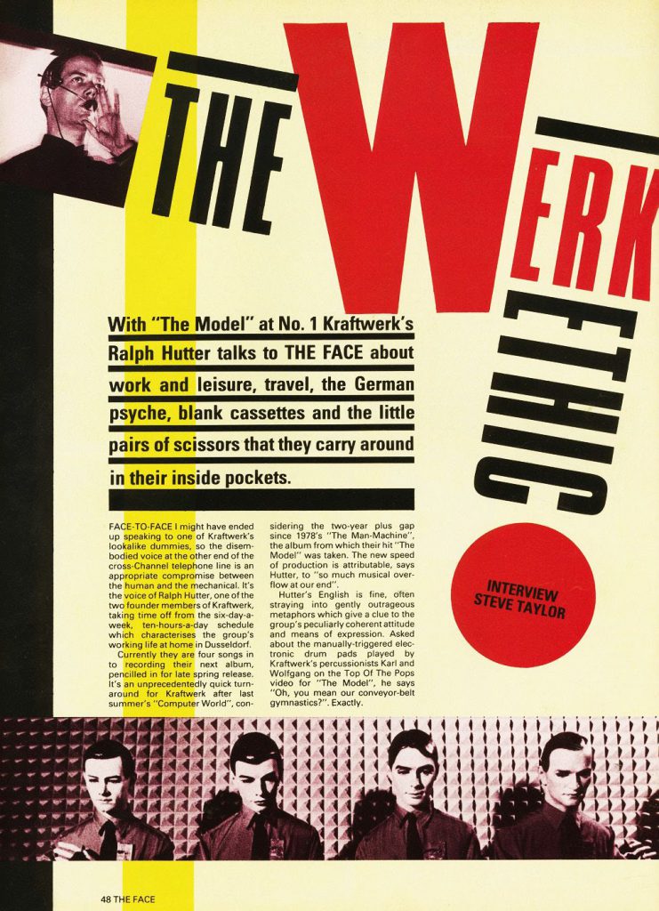
At The Face in the 1980s, he pushed design away from neutrality toward a more expressive visual language: compressed type, abrupt hierarchy, asymmetry, and friction. This helped redefine editorial design and influenced digital typography, experimental branding, and the idea that type could carry mood, ideology, and attitude.
Brody’s breakthrough came through his work for The Face, where he transformed magazine design into a more experimental visual field. Instead of treating typography as a transparent container for content, he used it to create tension, rhythm, and attitude. Abrupt hierarchy, compressed forms, asymmetry, and visual collision gave the magazine a language that felt inseparable from the cultural energy around it. That work helped redefine editorial design in the 1980s and remains central to Brody’s legacy.
His work in type design and branding extended that legacy into the digital era, where systems still need personality. Brody matters because he showed that design can be both structured and disruptive.
Spread from The Graphic Language of Neville Brody 3 © 2023 Neville Brody
Why Neville Brody Still Matters to Design Students
Brody is important for design students because he balances experimentation with control. His rebellious-looking work is not random; beneath the attitude and distortion lies a deliberate structure. This teaches young designers that expressive work is stronger when built on systems. Brody’s career also spans several of design history’s major shifts, from record sleeves and magazines to digital type, branding, and communication systems. Students learn from him how to break rules—and why they exist. He is best studied not as a style to copy, but as a test of visual language’s limits without losing coherence.
Neville Brody’s Creative Process
Brody’s creative process balances systems and disruption. Across editorial work, type design, and later brand projects, he seems to begin with a conceptual frame—identity, tone, rhythm, hierarchy—then push type and composition toward a more charged effect. He strains structure rather than rejecting it, making his work feel chaotic yet controlled. His typefaces, such as Industria, Arcadia, and Insignia, grew from specific editorial needs and experiments, not abstract exercises. For students, a key lesson is that innovation often starts with a live problem.
Brody’s typefaces were just as influential as his editorial layouts. Designs such as Industria, Arcadia, Insignia, and later FF Blur showed how type could move beyond neutrality and become part of a publication’s voice or a brand’s atmosphere. Type Network notes that Industria grew out of headline work for The Face, while Arcadia and Insignia developed from his work for Arena, which underlines how closely his typography emerged from real editorial problems rather than abstract formal exercises.
That reading of his process is partly an editorial inference from the work itself, but it fits both his magazine design and his later brand practice, which still emphasizes building visual foundations rather than surface style.
Where to See Neville Brody’s Work and Learn More
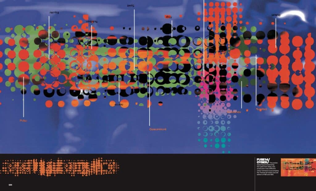
Students who want to study Neville Brody seriously should begin with a few key sources. The MoMA online collection includes his typeface, FF Blur, offering context within the history of digital typography. Brody Associates shows how his practice evolved into contemporary brand systems, custom type, and visual identities. The Royal College of Art profile provides insight into his work as an educator. For experimental work, FUSE 1–20 reveals how Brody and Jon Wozencroft reimagined typography.
To understand Brody properly, it is worth looking at both his practical design work and the ideas that shaped it.
Neville Brody still matters because he expanded the role of graphic design itself. He treated typography as something unstable, expressive, and culturally loaded, while still grounding it in structure. That combination of control and disruption is what keeps his work relevant now. For anyone trying to understand how graphic design moved from print modernism into digital visual culture, Brody remains one of the essential figures.


